Since its creation, the RQT Portal has aimed to be the leading resource for telehealth in Quebec. The website caters to a broad audience and is divided into three sections: Patients, Healthcare Professionals, and Telehealth Practitioners. Centralizing information enables healthcare professionals and other stakeholders in the healthcare network to easily find resources to recommend to their patients.
Did you know?
The RQT Portal was established as part of a provincial integration strategy launched in 2019. Since then, the four telehealth coordination centres (CCTs) have gradually closed their individual websites to consolidate information on telesantequebec.ca. This collaboration has been highly successful, strengthening network cohesion that continues to thrive today. Want to learn more? Check out the section The RQT.
However, this centralization can pose challenges for users who believe that the site is exclusively tailored to their needs. For instance, a patient might accidentally click on the “Clinical Telehealth Services” link within the Healthcare Professional section, ending up in an irrelevant area, thereby complicating information retrieval and site navigation.
To address this issue, we are implementing two significant modifications to the navigation on the RQT Portal:
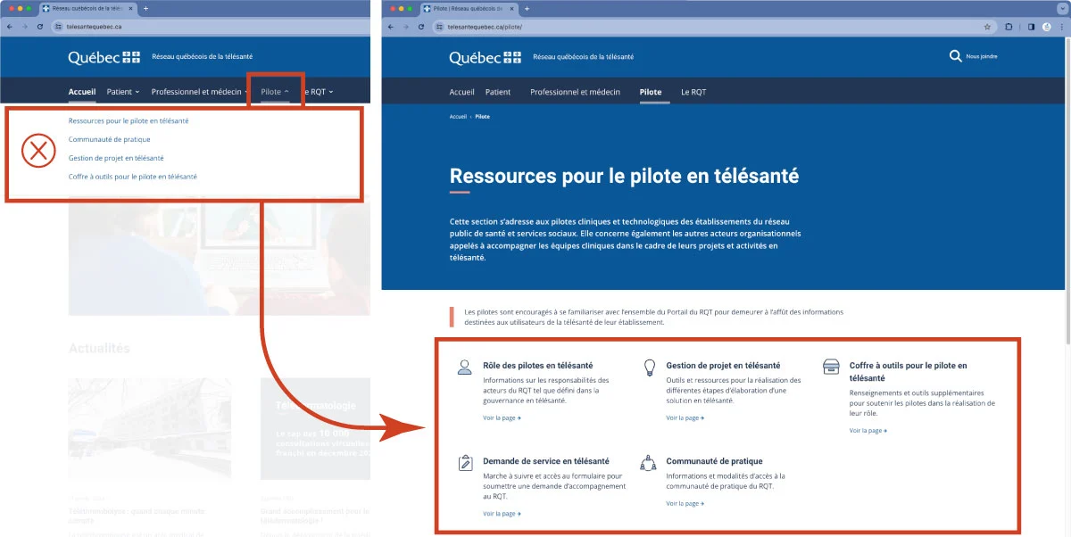
- Removing dropdown menus from the navigation bar: The links in dropdown menus do not cover all the topics and pages within a section, giving the impression that the section is limited to these few pages.
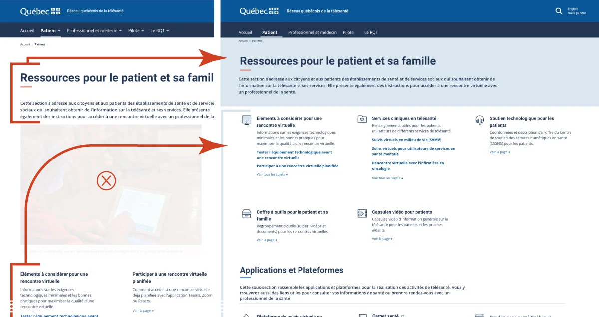
- Emphasizing essential starting points for navigation: The section pages dedicated to each audience should serve as the starting point for user navigation. However, these pages were not clearly differentiated in the previous design.
These solutions were developed by specialized experts in User Experience (UX) design, utilizing feedback identified through the page review widget.
Removing dropdown menu links for enhanced navigation
Dropdown menus, commonly used in navigation bars, provide quick navigation through hierarchical links.
However, for a website undergoing constant expansion and containing over a hundred pages, this method is not optimal. To address this challenge, the RQT Portal adopts the navigation method used on the Quebec.ca government website, removing dropdown links while maintaining the permanent display of sections (Patient, Healthcare Professional, Pilot, and The RQT). This modification aims to simplify user navigation and orientation.

Finding the information that matters to you easily
“A simple design is not a poor design”
As a central philosophy of the RQT Portal, this design approach aims to eliminate decorative and superfluous elements. Overbearing images have been removed to prioritize contrasting color banners, specific to each section, thus emphasizing essential content. This allows users to navigate more efficiently through the various informational topics provided by the section. Additionally, functional icons have been integrated to provide clear visual cues, and color elements will be added to strengthen the link with each section.

Share your feedback, we’re listening!
The RQT Portal team is committed to providing you with a website that meets your expectations and facilitates your online journey. To achieve this, we rely on you, valued members of our user community, to share your ideas and evaluate the content of telesantequebec.ca.
In the fall of 2023, a page evaluation module was implemented to gather your feedback. So far, we have received over a hundred responses.
Whether your feedback concerns improvement suggestions, innovative ideas, or simply expressing your satisfaction, we want to keep hearing from you! To provide your feedback, simply fill out the short page review widget at the end of each page of the site.
Thank you for your time and contribution to the improvement of the Réseau Québécois de la télésanté Portal.
Last update: November 28, 2024
